The exact dimensions
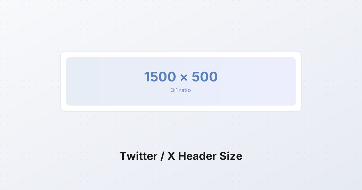
Twitter (now X) recommends a header image of 1500×500 pixels, which works out to a 3:1 aspect ratio. That is the number to design for, the number to export at, and the number to verify against before you upload.
The platform accepts a small range around that:
- Minimum: 1252×334 px
- Recommended: 1500×500 px
- Maximum: 1500×500 px (larger files get downscaled on upload)
Anything below 1252×334 will be rejected outright with an "image too small" error. Anything wider than 1500 px gets resized down to 1500 px wide, so the extra pixels are wasted bandwidth. Anything taller than 500 px gets cropped, often unpredictably. Stick with 1500×500.
File format and size limits as of 2026:
| Format | Supported | Notes | |---|---|---| | JPG | yes | best for photographic content, smaller files | | PNG | yes | best for text, logos, sharp edges | | GIF | yes | static GIFs only, no animation in headers | | WebP | yes | smaller than PNG, sharper than JPG at low bitrates |
Max file size is 5 MB, raised from 2 MB in 2023 as part of the X rollout. Older guides still cite 2 MB — that number is wrong. But you should not be anywhere near 5 MB anyway. A 1500×500 PNG with brand colors and minimal text lands at 200–500 KB. A photographic JPG at q85 lands at 100–250 KB. If your header is over 1 MB, something is wrong with the export.
The profile picture overlap
Here is the catch every guide skips. Your header is 1500×500, but the visible area is smaller — because the profile picture sits on top of it.
The profile picture itself is uploaded at 400×400 px (1:1, also recommended). On the profile page it is displayed as a circle roughly 134×134 px on desktop and slightly smaller on mobile. That circle is anchored to the bottom-center of the header, overlapping the middle-bottom band of your image by about 60–80 px vertically and 134 px horizontally.
In practice this means a horizontal strip roughly 400 px wide and 80–100 px tall at the bottom-center of your header is covered by the profile picture on every device. Put a logo, a face, or a word there and it disappears behind the avatar.
There is no setting to change this. The overlap is structural — it is how X lays out the profile page.
The safe zone
Designers talk about "safe zones" — the regions of an image guaranteed to be visible across every device and viewing context. For X headers, the safe zone is the top 350–400 pixels, full width.
| Region of header (1500×500) | Visibility | What to put here | |---|---|---| | Top 0–100 px | Always visible on desktop, partially cropped on mobile | Brand color, texture, sky | | 100–350 px (the middle band) | Safest area, visible everywhere | Logos, taglines, focal point | | 350–432 px | Visible on desktop, cropped on mobile | Secondary text, decorative | | 432–500 px (bottom strip) | Covered by profile info bar on desktop, cropped on mobile | Nothing important | | Center-bottom 400×80 px | Covered by profile picture on every device | Never put anything here |
The single most common mistake is placing the brand name or logo in the bottom-center. It looks fine in the design tool, then gets hidden behind the profile picture the moment it goes live.
A useful mental model: design your header as if the bottom 100 pixels and the center 400×80 region do not exist. Anything you place there is decoration, not information.
Mobile vs desktop cropping
The 1500×500 spec is the same on mobile and desktop. What changes is how much of it is visible.
- Desktop browser — X displays the header at roughly 1500×382 px, cropped from the top. The bottom 118 px is hidden behind the profile info bar (the row with the bio, location, and follow button).
- Mobile app (iOS and Android) — the header is displayed at roughly 375×125 px equivalent, which means even tighter cropping. Roughly the top 30 px and bottom 100 px of the original 500 are cut. The visible area on mobile is the middle ~370 px of the original.
- Mobile web — somewhere between the two, closer to the mobile app behavior.
The practical consequence: anything in the top 30 px or bottom 100 px is unstable. The middle band — roughly y=100 to y=400 in your 500-px-tall canvas — is the only zone that survives every context. This is why the safe-zone table above treats that middle band as the only "safe" region.
Mobile also renders the header at a much smaller physical size. A 1500×500 header shrunk to 375 px wide is 125 px tall on a phone. Text that looks legible at 1500×500 (say, 24 pt) becomes 6 pt on mobile — readable on a flagship phone, invisible on a 4-inch budget Android. If you must use text, design it to be legible at 400 px wide. If it is illegible at 400 px, it is illegible on mobile.
Why 3:1 is brutal to design for
The 3:1 aspect ratio is extreme. A standard landscape photo is 16:9 (1.78:1). A cinema frame is 2.39:1. The X header at 3:1 is wider than either — almost a panoramic strip.
This creates three specific design problems:
Faces do not work. A typical portrait orientation is the wrong shape. A landscape photo of a person is usually 3:2 or 16:9 — putting them in a 3:1 frame either crops them at the head and torso or leaves them tiny in the middle of a wide band of empty space. Unless you have a deliberately wide group shot, do not put faces in headers.
Symmetry is fragile. A centered logo or wordmark looks balanced in the design tool, then sits awkwardly once the profile picture overlays the bottom-center. Off-center compositions survive the overlay better.
Text needs to be huge. At 1500×500, a 40-pixel-tall word looks substantial. Displayed at 400 px wide on mobile, that same word is 13 pixels tall — borderline. Displayed at 150 px wide in a notification, it is 5 pixels — gone. Use text sparingly, and when you do, use 60+ pixels.
Design principles that actually work
Five rules that consistently produce headers that survive X's layout:
-
Treat it as a banner, not a photo. The header is a background band, not a hero image. Brand colors, gradients, textures, and abstract patterns work better than photos. If you must use a photo, treat it as a backdrop and overlay brand elements on top.
-
One focal point, off-center. Place your logo or key visual in the left third or right third of the safe zone (y=100–400, x=150–600 or x=900–1350). The center is reserved for the profile picture overlap; the bottom is cropped on mobile.
-
Minimal text. A logo wordmark, a tagline, or nothing. Do not try to fit a paragraph. If viewers cannot read it at 400 px wide, remove it.
-
High contrast against the profile picture. The profile picture sits on top of the header. If your header is busy in the bottom-center, the avatar disappears into it. Keep the bottom-center either solid or very low-contrast.
-
Test at 1500×500, then at 400×133. Design at full size, then shrink the canvas to 400×133 (the mobile display size). If everything is still legible and balanced, ship it. If text vanishes or the focal point crowds the edge, redesign.
Photographic content that does work: wide landscapes, skylines, product flat-lays shot from above, panoramic street scenes, wide architectural interiors. Anything that reads as "atmosphere" rather than "subject" handles the 3:1 ratio well.
Common mistakes
The mistakes that show up in nearly every redesign-after-launch:
- Critical content in the bottom-center. Logo, URL, tagline, or contact info placed in the 400×80 zone gets covered by the profile picture. Move it up by at least 100 px.
- Content within 30 px of any edge. The top edge crops on mobile; the bottom edge crops everywhere. Leave a 30–50 px margin on all sides for the safe zone, with extra margin at the bottom.
- Uploading a 16:9 image. A 1920×1080 photo forced into a 3:1 frame either gets letterboxed (black bars top and bottom), center-cropped (losing the sides), or stretched (distorting every element). Crop to 3:1 in your editor first — do not let X's uploader guess.
- Tiny text. Anything below 30 px at the full 1500×500 size is invisible on mobile. Anything below 60 px is risky.
- Faces centered. A face in the center of the header sits behind the profile picture on every device. Off-center faces, or no faces, work better.
- Forgetting that X recompresses. X's CDN re-encodes every header on upload. A 5 MB PNG gets crushed to ~200 KB. Avoid fine gradients (they band after recompression) and avoid text over busy backgrounds (halos appear around the letters).
The X rebrand: same specs, new name
Twitter became X in July 2023. The rebrand changed the logo, the brand color (from Twitter blue to a near-black), and the name. It did not change the header specification.
- Header size: still 1500×500 px
- Profile picture size: still 400×400 px
- File formats: still JPG, PNG, GIF, WebP
- Max file size: raised from 2 MB to 5 MB in 2023 (the only spec change)
Old guides calling it the "Twitter header" are not wrong about the dimensions, only about the name. Both terms — "Twitter header" and "X header" — refer to the same 1500×500 image and the same layout constraints. Use whichever term your audience searches for; the spec is identical.
X header vs LinkedIn banner vs Facebook cover
Each major platform has its own banner spec. Cross-posting the same image without resizing guarantees a crop somewhere.
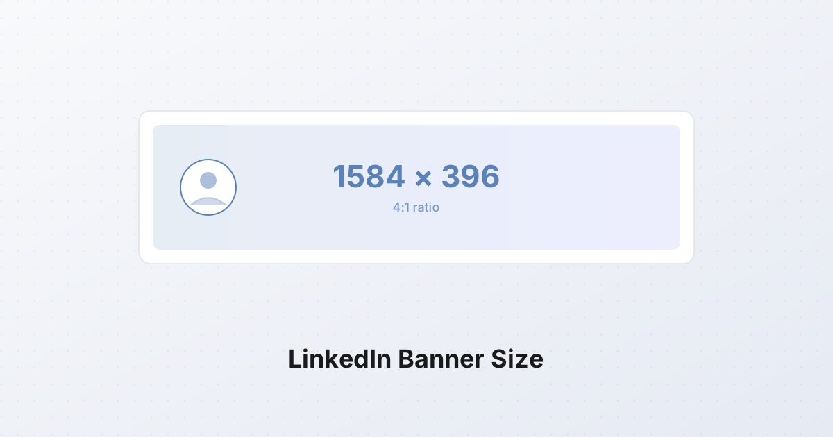
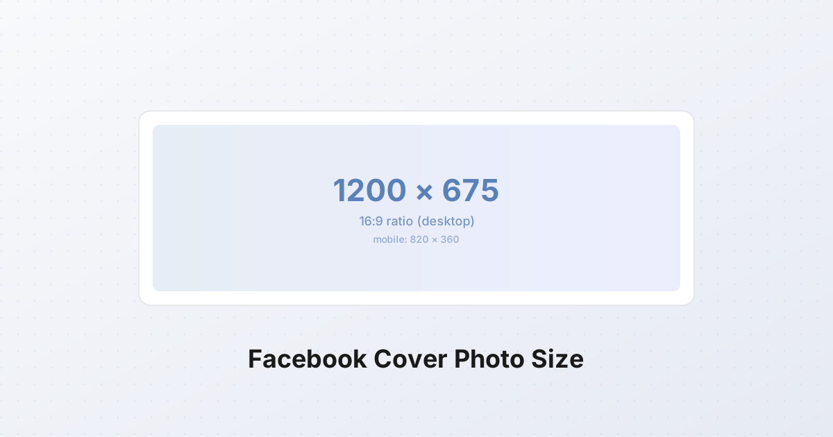
| Platform | Recommended size | Aspect ratio | Safe zone | Notes | |---|---|---|---|---| | X (Twitter) header | 1500×500 | 3:1 | top 350 px, avoid bottom-center 400×80 | profile picture overlaps bottom-center | | LinkedIn banner | 1584×396 | 4:1 | center 1200×320, avoid edges | profile picture sits bottom-left, smaller overlap | | Facebook cover (desktop) | 820×312 | 2.63:1 | center 820×250, avoid top/bottom 30 px | crops differently on mobile (640×360 visible) | | Facebook cover (mobile) | 640×360 | 16:9 | center 640×280 | desktop cover gets cropped on mobile | | YouTube banner | 2560×1440 | 16:9 | center 1546×423 | safe zone is much smaller than total; everything outside crops on TV/mobile | | Discord banner | 600×240 | 2.5:1 | full canvas, no overlap | no profile picture overlap |
The key differences for cross-posting:
- An X header (3:1) used as a LinkedIn banner (4:1) loses roughly 25% of its height. Bottom content vanishes.
- A LinkedIn banner (4:1) used as an X header (3:1) either gets letterboxed or center-cropped.
- A Facebook cover (2.63:1) used as an X header (3:1) crops left and right edges, losing roughly 12% of the width.
- A YouTube banner is a completely different shape — never reuse it as-is for any other platform.
If you maintain brand banners across platforms, design a master 16:9 composition with the focal point in the center 30% of the frame, then crop variants for each platform. One design, six exports.
How to make a Twitter/X header, step by step
The full workflow, from blank canvas to uploaded header.
1. Create a 1500×500 canvas. In any image editor — Figma, Photoshop, Canva, Photopea, or the SynoxTools cropper — start with a 1500×500 document at 72 DPI. DPI does not matter for screen display; only pixel dimensions do.
2. Lay out the safe zones as guides. Add four guide lines:
Horizontal at y=100   (top of safest band)
Horizontal at y=400   (bottom of safest band)
Vertical   at x=550   (left edge of profile-picture zone)
Vertical   at x=950   (right edge of profile-picture zone)
The region between y=100 and y=400, outside the x=550–950 center, is your design canvas. Anything inside the center bottom or below y=400 is decoration only.
3. Place your background. Brand color, gradient, texture, or a wide photo. If photo, darken or lighten it enough that foreground elements (logo, text) have contrast.
4. Place your focal point. Logo, wordmark, or key visual. Off-center: left third (x=150–500) or right third (x=1000–1350). Vertically centered in the safe band (y=200–300).
5. Add minimal text if any. Tagline, URL, or nothing. Font size 60 px minimum at full resolution. Sans-serif works better than serif at small sizes.
6. Export. PNG if the header has text or sharp edges. JPG at quality 85 if it is photographic. WebP if you want the smallest file with no visible quality loss. Keep the file under 1 MB — X recompresses anyway, so anything larger is wasted.
7. Test at mobile size. Resize the exported file to 400×133. If text is still legible and the focal point is still visible, ship it. If not, go back to step 4.
8. Upload and verify. Upload at x.com/settings/profile, then check the profile on both desktop and mobile. Specifically check whether the profile picture covers anything important and whether the top edge crops a critical element on mobile.
Resizing an existing image to 1500×500
Most headers are not designed from scratch — they are repurposed from an existing photo or brand asset. The path from "existing image" to "1500×500 header" depends on the starting aspect ratio.
If your source is wider than 3:1 (e.g., a 1920×500 panorama): resize the width to 1500, then crop the height to 500. Open the SynoxTools resizer, set width to 1500, then use the cropper to trim to 500 px tall.
If your source is narrower than 3:1 (e.g., a 1500×1000 photo): you have to crop the height down. Open the cropper, set the aspect ratio to 3:1, position the crop window over the most important part of the image, and export at 1500×500. Some content will be lost — that is unavoidable when going from a less wide to a more wide ratio.
If your source is already 3:1 (e.g., another X header): just resize to 1500×500. No cropping needed.
If your source is 16:9 (e.g., a YouTube thumbnail or a standard landscape photo): the most common case. You have two choices. Either crop to 3:1 (losing 33% of the height — the top and bottom thirds) or letterbox to 3:1 (adding solid bars top and bottom). Cropping is almost always the right call; letterboxed headers look like mistakes.
A practical recipe for a 1920×1080 source:
- Open the image in the cropper.
- Set aspect ratio to 3:1 (or enter 1500×500 directly).
- Position the crop window to keep the subject in the safe zone (left third or right third, vertically centered).
- Export at 1500×500.
- If the file is over 1 MB, run it through the resizer at quality 85 (for JPG) or convert to WebP.
Testing before you commit
The final check before you click "Save" on the X profile settings:
- Open the exported 1500×500 file at 100% zoom in a browser. Does it look right at full size?
- Resize the browser window so the image displays at ~400 px wide. Is the text still legible? Is the focal point still recognizable?
- Crop a 400×80 region from the bottom-center. Does losing that region destroy the design? If yes, the focal point is in the wrong place — go back.
- Check the file size. Under 1 MB? Ship it. Over 2 MB? Re-export.
If all four checks pass, the header will look correct on desktop, on mobile, in notifications, and behind the profile picture. The 3:1 ratio is unforgiving, but the rules are deterministic — once you internalize the safe zone and the profile-picture overlap, every header you ship from here on out will land clean.