The two things that decide if someone clicks
When your video appears in a YouTube feed, the viewer's decision to click or scroll past takes about 200 milliseconds. Two pieces of information carry almost all of that decision: the thumbnail and the title. Of the two, the thumbnail does the heavy lifting — eye-tracking research from YouTube's Creator Academy consistently shows viewers fixate on the thumbnail 70-80% of the time before they ever read the title.
That makes the thumbnail the single most important creative asset you produce for a video. The editing, the audio mix, the script — those decide whether viewers stay. The thumbnail decides whether they arrive.
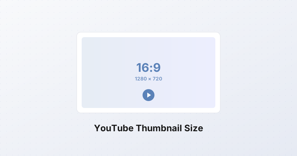
YouTube enforces one format for every thumbnail on the platform: 1280×720 pixels, 16:9 aspect ratio, max 2 MB, in JPG, PNG, GIF, WebP, or BMP. Get it wrong — wrong ratio, wrong size, text that vanishes at mobile width — and you've handed the click to whoever appears next to you in the feed.
The official YouTube thumbnail spec
YouTube documents these in their Help Center. They are not negotiable — the upload dialog rejects anything outside them.
| Parameter | Value | |---|---| | Recommended resolution | 1280×720 px (width × height) | | Minimum width | 640 px | | Aspect ratio | 16:9 (1.777:1) | | Maximum file size | 2 MB | | Accepted formats | JPG, PNG, GIF, WebP, BMP | | Color space | sRGB recommended |
1280×720 is the resolution that matches a 720p video frame 1:1. It is also the maximum size YouTube will display; larger uploads are silently downscaled. There's no benefit to going higher. A 1920×1080 thumbnail is accepted (same 16:9 ratio) but costs you file size and bandwidth for no visible gain.
The 640 px minimum matters because YouTube refuses anything narrower. If your source is smaller than 640 px wide, you must upscale before uploading — and upscaling produces soft, blurry thumbnails that read as low-effort. Start from a high-resolution source (a 1920×1080 video frame, a 4000×3000 photo) and downscale.
The 2 MB cap is generous for a 1280×720 image. A well-compressed JPG at this size is 150-300 KB; a PNG is 1-2 MB; an uncompressed BMP can exceed 2 MB and will be rejected. Stick to JPG or WebP and you'll never hit the limit.
Why 16:9 is non-negotiable
The YouTube video player is a 16:9 rectangle. It has been since 2008, when YouTube moved away from the original 4:3 player. Every video renders inside that 16:9 frame, and every thumbnail — feed, search, recommended sidebar, player poster frame — is fitted into the same box.
If your thumbnail is 4:3 (1.333:1) or 1:1 (square), YouTube either letterboxes it (black bars on the sides; you lose ~25% of visible area on a 4:3 image, ~44% on a 1:1 image) or center-crops it (sides cut off, content lost). Which one happens depends on where the thumbnail is displayed — feed tends to letterbox, player poster frame tends to crop. Either way, you've lost control. Design at 16:9 from the start.
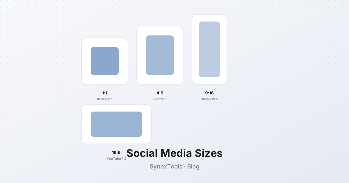
A few vertical video formats (9:16 Shorts, 4:5 feed posts) are exceptions, but those are separate upload flows. For standard YouTube videos, it's 16:9, full stop.
Safe zones: what gets cropped where
A 1280×720 thumbnail is rendered at very different physical sizes depending on where it appears:
- Desktop feed — ~360×200 px in the "up next" sidebar, ~246×138 px in search results grid.
- Mobile feed — ~320×180 px, full width of the phone screen.
- TV app — ~1920×1080 px, upscaled and stretched across a 55-inch display.
- Watch page poster frame — full player width, up to 1280×720 native.
YouTube also overlays UI elements on top of your thumbnail — most notably the video duration timestamp in the bottom-right corner, which covers roughly 90×30 px at 1280×720 scale.
The practical safe-zone model:
+------------------------------------------+  1280 px wide
|        UNSAFE — may crop on TV           |
|  +----------------------------------+    |
|  |                                  |    |
|  |                                  |    |
|  |       SAFE ZONE                  |    |
|  |   (1000 x 600, centered)         |    |  720 px tall
|  |                                  |    |
|  |                                  |    |
|  |                          [00:42] |    |  duration overlay
|  +----------------------------------+    |
|        UNSAFE — may crop on TV           |
+------------------------------------------+
The safe zone — where every critical element (face, headline text, focal object) must live — is roughly 1000×600 pixels, centered both horizontally and vertically, with at least 140 px of margin on left/right and 60 px top/bottom. Stay inside this and your thumbnail will read correctly on every device YouTube serves.
For the duration timestamp specifically, leave the bottom-right 120×40 px region free of text. Faces that overlap this region get a "0:42" stamped on their chin; it looks unprofessional.
If you want to encode the safe zone in CSS — for a thumbnail preview tool, a Figma plugin, or a design template — this is the box:
css.thumbnail-safe-zone {
  position: absolute;
  top: 60px;       /* 8.3% of 720 */
  left: 140px;     /* 10.9% of 1280 */
  width: 1000px;   /* 78.1% of 1280 */
  height: 600px;   /* 83.3% of 720 */
  border: 2px dashed rgba(255, 50, 50, 0.6);
  pointer-events: none;
}
The thumbnail is half your CTR
CTR is the percentage of impressions that turn into clicks. Average CTR varies by channel size and niche — a top creator might average 6-8%, a faceless finance channel might see 3-4%, a brand-new channel can see 1-2%. The reasonable benchmark is 4-6% for an established channel in a competitive niche, 8-10%+ for an established channel with a loyal audience.
A great thumbnail can lift CTR by 2-4 percentage points. On a video with 100,000 impressions, that's the difference between 4,000 and 8,000 clicks — and YouTube's algorithm rewards the click-rich video with more impressions, compounding the gap.
This is why every major creator pre-tests thumbnails. MrBeast famously shoots multiple thumbnail concepts before a video is edited, picks the strongest, and sometimes reshoots a video's premise if the thumbnail doesn't land. Most creators can't go that far, but the principle applies to everyone: spend at least as long on the thumbnail as on the first 30 seconds of the video.
Design principles for high-CTR thumbnails
These are not aesthetic opinions — they're the patterns that show up consistently in thumbnails with above-average CTR across thousands of analyzed videos.
High contrast
The thumbnail competes against 5-10 other thumbnails in the feed, all visible at once. Low-contrast images — soft pastels, muddy mid-tones, beige on beige — disappear. High-contrast images pop. The reliable formula: one dominant warm color (red, orange, yellow) against one dominant cool color (deep blue, teal, dark gray). MrBeast's red-and-yellow palette, Mark Rober's teal-and-orange, the blue-and-yellow tech channel look — all variations on this.
A useful pre-check: desaturate your thumbnail. If the grayscale version is mostly mid-gray with no clear bright and dark regions, the color version is low-contrast and needs a stronger value structure before color even matters.
Three to five words of text overlay, maximum
Text overlay is a force multiplier — it adds context the title doesn't have to carry. But it only works if the viewer can read it at the smallest size the thumbnail renders, which is roughly 320 px wide on mobile.
At 320 px wide, your 1280 px source is downscaled by 4×. An 80-pixel font in the source becomes 20 pixels on mobile — readable. A 30-pixel font becomes 7 pixels — illegible. The rule: 3-5 words max, font size 80-120 px in the 1280×720 source, with a thick stroke or a solid background plate behind the letters. Anything more is clutter; anything smaller is invisible on the device where 70% of YouTube viewing happens.
One focal subject
The eye locks onto one thing at a time. Thumbnails with one clear focal subject — a face, an object, a before/after split — outperform thumbnails with three or four competing elements. This is why the "face with shocked expression + object in hand" pattern works: the face is the focal, the object adds context, the brain processes both in one glance. If your concept requires multiple subjects, make one of them 3× larger than the others — size is the strongest visual hierarchy signal.
Emotion or curiosity gap
A click is a decision made on incomplete information. The viewer either feels something (excitement, outrage, curiosity, recognition) or senses the thumbnail is hiding something they need to know. The two patterns that produce clicks:
- Emotion — a face showing a strong, unambiguous emotion (shock, joy, disgust, confusion). The viewer wants to feel that emotion themselves and clicks to find out what caused it.
- Curiosity gap — a thumbnail that shows part of a result but withholds the cause or the conclusion. "I tried X for 30 days" with a thumbnail showing the dramatic before/after. The viewer has to click to find out what X was.
Without one of these, the thumbnail is informational, not motivational. Informational thumbnails work for search intent (someone looking up "how to wire an outlet" will click any clear, relevant thumbnail); they fail in browse intent (someone scrolling the feed needs a reason to stop).
Common mistakes that kill CTR
- Text too small — anything below 60 px in the 1280×720 source is unreadable on mobile. Test at 320 px wide before publishing.
- Too busy — five elements, three fonts, four colors, a background pattern. The eye can't find a focal point and the brain moves on. If you can't describe your thumbnail in one sentence ("a guy holding a giant burger, shocked face"), it's too busy.
- Content at the edges or wrong ratio — YouTube crops the outer 5-10% on TVs and in some feed placements, and it doesn't auto-crop a 4:3 or 1:1 image to 16:9 for you. Keep important content inside the 1000×600 safe zone and design at 16:9 from the start.
- Burying the face — faces are the strongest click trigger in the human visual system. A face at 30% of the frame and 70% background outperforms the reverse by a wide margin. Get the face large, get the emotion clear.
- Using a frame from the video as-is — a video frame is a moment in motion; a thumbnail is a poster. Stage the thumbnail separately.
Mobile vs desktop: test at 320 px
The single most useful pre-publish test for a thumbnail is to resize it to 320 px wide and look at it on a phone screen next to four or five other thumbnails. That's the context your viewers see it in.
At 320 px wide, your 1280 px source is downscaled by 4×. Text smaller than ~20 px (80 px in the source) becomes unreadable. Faces need to be at least 80×80 px (320×320 in the source) to register emotion. Color contrast that looks fine on a 27-inch monitor disappears on a phone in sunlight.
The workflow: design at 1280×720, export a 320×180 preview, pin it next to your monitor. Iterate until the preview reads clearly. Then export the final 1280×720 for upload.
Verified badges and how they affect layout
Channels that meet YouTube's verification threshold (100,000+ subscribers, plus other criteria) get a gray checkmark badge next to their name in the feed. The badge appears in the bottom-left of the thumbnail, roughly 100×30 px at 1280×720 scale. Treat the bottom-left 120×40 px region like the bottom-right duration timestamp: keep it clear of important content.
A/B testing thumbnails on YouTube (2026)
YouTube rolled out the Test & Compare feature to most creators in late 2023 and has expanded it through 2025-2026. It lets you upload up to three thumbnail variants for a single video; YouTube serves each variant to a portion of your audience for a test period (typically 7-14 days, or until statistical significance is reached). The winning variant by CTR becomes the permanent thumbnail.
To access it: in YouTube Studio, open a published video, go to the Thumbnail section, and look for "Test & Compare" (sometimes still labeled "Thumbnail test"). Upload 2-3 variants, click Start Test, and walk away.
The data you get back is per-variant CTR and per-variant average view duration. The combination matters: a thumbnail with high CTR but low average view duration is clickbait — viewers clicked, felt misled, and left. YouTube's algorithm punishes this. You want the variant that wins on CTR multiplied by average view duration, not CTR alone.
Three practical notes:
- Run tests on videos with traction. A test on a video with 100 impressions per day produces no signal; a video with 1,000+ impressions per day produces a winner in days.
- Test one variable at a time. Don't change text, focal subject, and color palette simultaneously — you won't know which change moved the metric.
- Don't trust the first 24 hours. Initial CTR is dominated by your subscriber base, who click at a different rate than the broader audience the algorithm eventually serves.
How to resize an existing image to 1280×720
If your source image — a video frame, a photo, a design export — isn't 1280×720, you need to get it there before uploading. Two operations are involved:
- Crop to 16:9 if the source isn't already that ratio. A 4000×3000 photo (4:3) becomes 4000×2250 (16:9) before resizing down. Cropping first preserves composition; resizing first distorts it.
- Resize to exactly 1280×720.
The SynoxTools resizer handles both in one pass — set the target to 1280×720 with the "crop to fill" option enabled, and export. If the automatic center-crop cuts off a face you wanted to keep, the cropper lets you manually position the 16:9 frame before resizing. For sources that already match 16:9 — a 1920×1080 video frame, a 3840×2160 photo — pure resize is enough.
Batch: when you have 50 videos to thumbnail
Producing one thumbnail is a creative exercise. Producing 50 — for a back catalog, a course, or a multi-part series — is a workflow problem. Doing each one in Photoshop takes 20 minutes per thumbnail; that's 16 hours of repetitive work.
The pattern that scales:
- Design a template. Same font, same color palette, same position for the focal subject, same text-overlay slot. The template holds 80% of the design fixed; each thumbnail only swaps in a new focal image and new text.
- Generate the 50 source images. Video frames, photos, screenshots — whatever the focal subject is for each video. Keep them in one folder.
- Batch-resize every source to 1280×720 in one pass. The batch resizer takes the whole folder, applies the same 16:9 crop + 1280×720 resize to every file, and returns a ZIP.
- Apply the template. In your design tool (Figma, Photoshop, Canva), open the template, drop in the resized focal image, replace the text overlay, export as 1280×720 JPG. About 2 minutes per thumbnail.
- Upload all 50 to YouTube Studio.
The batch step turns 50 manual resize operations into one. The template step turns 50 design-from-scratch operations into 50 design-from-template operations. Together, they cut the work from 16 hours to under 2.
Step-by-step: making a YouTube thumbnail from scratch
A concrete walkthrough for a single thumbnail.
1. Pick the focal subject. This is the one thing the viewer must see. A face with an emotion, an object in a surprising context, a before/after split. Write it down in one sentence: "Shocked face holding a melted iPhone."
2. Capture the source. Shoot a photo, pull a frame from the video, or composite both. The source should be at least 1920×1080 — bigger than the final 1280×720 so you have room to crop and reframe.
3. Crop to 16:9. If your source is 4:3, 3:2, or 1:1, crop to 16:9 (e.g., 1920×1080) before any other editing. Center the focal subject inside the safe zone.
4. Resize to 1280×720. Downscale to the exact spec dimensions. Everything from here on happens at 1280×720.
5. Add the text overlay. 3-5 words, font size 80-120 px, with a thick stroke (5-8 px, contrasting color) or a solid background plate behind the letters. Position it inside the safe zone, away from the bottom-right (duration timestamp) and bottom-left (verified badge, if applicable).
6. Check contrast. Desaturate the thumbnail. If it's all mid-tones, push the brights brighter and the darks darker. Re-saturate.
7. Test at 320 px wide. Export a 320×180 preview. Open it on your phone next to a few other thumbnails. Can you read the text? Is the focal subject obvious? Does the emotion land?
8. Export as JPG, quality 90. File size lands at 200-400 KB, well under the 2 MB cap. WebP at quality 90 is also fine and ~20% smaller.
9. Upload to YouTube Studio. Settings > Video details > Thumbnail (the camera icon on the video). The upload dialog validates the file against the spec — if it rejects, fix the issue (wrong ratio, file too large, unsupported format) and re-upload.
10. After 1,000 impressions, evaluate. Open YouTube Studio's analytics and look at the CTR. If it's below your channel average, design a second thumbnail and use Test & Compare to A/B test them. Don't change the thumbnail on a hunch; let the data decide.