The two sizes that matter
Facebook cover photos live in a strange dual reality. Upload one image, and Facebook displays it at two completely different aspect ratios depending on whether the viewer is on desktop or mobile:
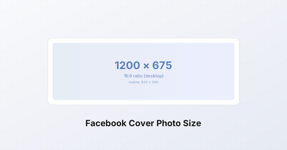
- Desktop: 1200×675 pixels, 16:9 ratio
- Mobile: 820×312 pixels, roughly 2.63:1 ratio
These are not minor variations. The desktop display is 2.16 times taller than the mobile display. The same image, shown on a phone, gets the top and bottom strips cropped off — and those strips together account for 53% of the vertical area you designed for desktop.
The 820×312 number you see in older guides is the mobile display size. The 1200×675 number is the desktop display size. Both are correct — for their respective contexts. This dual reality is the source of nearly every "my cover looks broken on mobile" complaint.
The recommended upload
Upload at 1200×675 px, JPG or PNG, under 100 KB.
Why 1200×675 and not 820×312? Two reasons:
- Desktop displays the full 16:9. If you upload 820×312, Facebook upscales it to roughly 1200×456 for desktop viewers, and the result looks visibly soft. A 1.46× upscale on text and edges is immediately noticeable on any modern monitor.
- Mobile crops from the larger image. Facebook takes your 1200×675 upload and crops an 820×312 strip from the center for mobile. If you design with the safe zone in mind, the same file serves both audiences without compromise.
The 100 KB cap is the strictest limit on any major social platform. Facebook compresses uploads aggressively — anything over 100 KB gets re-encoded by Facebook's CDN, and the re-encode quality is unpredictable. A 250 KB upload can come out at 60 KB with visible block artifacts and color banding. A 95 KB upload passes through untouched. The line between those two outcomes is the 100 KB threshold, and it is enforced silently.
The desktop/mobile crop problem
Here is exactly what happens to a 1200×675 upload on a phone.
The desktop display shows the full 1200×675 — every pixel you designed is visible. The mobile display takes the center 820-wide strip and crops it down to 820×312. The math:
- Vertical crop: 675 − 312 = 363 pixels removed, split as roughly 181 px from the top and 182 px from the bottom.
- Horizontal: no crop on mobile; the 1200-wide image is downscaled to 820 wide.
In other words, the top 27% and bottom 27% of your desktop design vanish on mobile. Only the middle 46% — the horizontal strip from y=181 to y=493 (in a 1200×675 canvas) — survives both views intact.
This is why designing for desktop first, then "hoping it looks okay on mobile," reliably fails. Anyone who has put a tagline near the top of a cover photo, or a logo near the bottom, has watched it disappear on a phone within minutes of publishing.
The safe zone
The safe zone is the region of the 1200×675 canvas that is visible on both desktop and mobile. It is a horizontal strip running across the full width of the image:
| Property | Value | |---|---| | Safe zone width | 1200 px (full canvas width) | | Safe zone height | 312 px | | Top edge (measured from top of canvas) | ~181 px | | Bottom edge (measured from top of canvas) | ~493 px | | Safe zone area as % of full canvas | 46% |
A visual map of the 1200×675 canvas:
┌──────────────────────────────────────────┐
│         CROPPED ON MOBILE                │  181 px
│         (top ~27%)                       │
├──────────────────────────────────────────┤
│                                          │
│              SAFE ZONE                   │  312 px
│   (visible on desktop + mobile)          │
│                                          │
├──────────────────────────────────────────┤
│         CROPPED ON MOBILE                │  182 px
│         (bottom ~27%)                    │
└──────────────────────────────────────────┘
        1200 px wide × 675 px tall
Everything critical — your logo, your headline text, your call to action, the face in a portrait — belongs inside the safe zone. The top and bottom strips are decoration: brand color washes, photographic backgrounds, atmospheric imagery. They can be lost on mobile without damaging the message.
The profile picture overlap
There is a second crop problem, and it sits on top of the first one. The profile picture — 170×170 px on desktop, 168×168 on mobile — sits in the bottom-left of the cover photo, overlapping it by roughly 170×100 px.
The overlap area is approximately:
- Starts at x = 24 px from the left edge
- Extends to roughly x = 194 px
- Vertically, occupies the bottom ~100 px of the safe zone
Practical implication: never put text or a logo in the bottom-left of the safe zone. That region is covered by the profile picture on every device. The overlap does not scale with the canvas — it is a fixed 170-ish pixel square regardless of screen size.
This is also why cover photos often feel "off-center" in their composition. The visual center of the cover, accounting for the profile picture overlap, is shifted up and to the right. A logo placed at the geometric center of the safe zone will appear slightly off-center to the eye — a logo placed at roughly (60%, 50%) of the safe zone will look centered to a viewer.
Design principles
Five rules, learned the hard way by every social media marketer who has shipped a Facebook cover:
1. Design for the safe zone first. Lay out your logo, headline, and any text inside the 1200×312 center strip. Treat the top and bottom 181-px strips as bleed area — they exist for desktop viewers only and should hold non-critical content.
2. Minimize text. Facebook's compression at the 100 KB threshold is unforgiving to small text. A 24-px headline that looks crisp on your design canvas will turn into a blocky, artifacted smear after Facebook re-encodes it. Use text sparingly — a short headline (3–6 words) and maybe a single sub-line. Long paragraphs of text on a cover photo are unreadable on mobile and barely readable on desktop after compression.
3. Prefer brand color or simple imagery. Solid brand colors, simple gradients, and clean product photography compress well and survive the 100 KB encode cleanly. Detailed illustrations, complex patterns, and high-frequency textures (foliage, water, hair) compress poorly and turn to mush. A single bold color with a logo is the safest possible cover.
4. Test at 820 px wide before publishing. Resize your design down to 820 px wide (which gives you 820×463, then mentally crop to 820×312 to simulate mobile). If the text is still legible at that size, it will be legible on a phone. If it isn't, the text is too small — go back and enlarge it.
5. Use the profile picture overlap as part of the design. Instead of fighting it, treat the bottom-left as the natural home for your profile picture. Place the logo or headline toward the center-right of the safe zone, and let the profile picture occupy the bottom-left visually.
Common mistakes
These are the failure modes I see over and over in audits of business pages:
- Critical content in the top or bottom 180 px. Taglines at the top of the cover, URLs at the bottom — both vanish on mobile, which is now roughly 80% of Facebook traffic. If 80% of your audience cannot read your call to action, the cover failed.
- Text in the bottom-left corner. The profile picture covers it on every device. Designers who do not know about the overlap often place their logo there, then watch it get buried under the avatar.
- File over 100 KB. Facebook's re-encoder does what re-encoders do: it picks a quality setting that hits its target file size, regardless of what you sent. A 400 KB PNG becomes a 60 KB JPEG with aggressive quantization. The visible result is banding in gradients, ringing around text edges, and a general "washed out" appearance. Stay under 100 KB and your upload passes through unchanged.
- Portrait image, forced into a landscape frame. A 1080×1920 phone photo, uploaded as a cover, gets center-cropped to 16:9. The center of a portrait photo is rarely the most important part — usually it is someone's torso or a horizon line, not a face. Crop intentionally before uploading; never let Facebook do it for you.
- Tiny text. Body text under 32 px in a 1200×675 canvas becomes unreadable after Facebook's compression. Headlines can go down to 48 px; supporting text should be 64 px or larger.
The other Facebook cover sizes
Facebook uses different dimensions for events, groups, and stories. They are not interchangeable — uploading a 1200×675 page cover as an event cover will be re-cropped and look wrong.
Facebook event cover
- Size: 1200×628 px
- Ratio: 1.91:1 (the Open Graph standard ratio)
- File: JPG or PNG, recommended under 100 KB
- Notes: This is the same ratio Facebook uses for link previews and shared images — the platform treats event covers as a link-preview-style image. There is no desktop/mobile split for event covers; the 1200×628 is shown consistently across devices.
Facebook group cover
- Size: 1640×856 px
- Ratio: ~1.91:1
- File: JPG or PNG, recommended under 100 KB
- Notes: Group covers are larger than page covers because groups display the cover at full width on the group landing page. There is still a small profile-picture overlap in the bottom-left, but it is smaller relative to the canvas. The safe zone for groups is roughly the middle 1100×560 strip.
Facebook story
- Size: 1080×1920 px
- Ratio: 9:16 (vertical)
- File: JPG, PNG, or video (MP4 / MOV)
- Notes: Stories are vertical, full-screen on mobile. There is no desktop equivalent — Stories are mobile-only. Leave a 250-px margin at the top (for the profile picture and story progress bar) and 250 px at the bottom (for the "swipe up" / reply bar) for the safe zone.
Comparison: cover vs event vs group vs story
| Placement | Dimensions | Ratio | Safe zone | File cap | |---|---|---|---|---| | Page cover (desktop view) | 1200×675 | 16:9 | Middle 1200×312 strip | 100 KB | | Page cover (mobile view) | 820×312 | 2.63:1 | N/A — it IS the safe zone | 100 KB | | Event cover | 1200×628 | 1.91:1 | Most of the canvas | ~100 KB | | Group cover | 1640×856 | ~1.91:1 | Middle ~1100×560 | ~100 KB | | Story | 1080×1920 | 9:16 | Middle 1080×1420 | None enforced |
The pattern: page covers are the only placement with the dramatic desktop/mobile split. Events, groups, and stories all display consistently across devices — which makes them easier to design for, but they each have their own dimensions and you cannot reuse one file for another without re-cropping.
How to resize and crop to 1200×675
The fastest path from a raw photo or design export to a Facebook-ready cover:
- Start with a 16:9 source. If you are working from a 4:3 or portrait photo, crop it to 16:9 first using the cropper. The cropper lets you lock the aspect ratio to 16:9 and reposition the crop window to keep the subject framed.
- Resize to 1200×675. Use the SynoxTools resizer to bring the file down to exactly 1200×675. If the source is larger than 2400×1350 (2× for retina), downscale. If smaller, do not upscale — find a higher-resolution source instead.
- Check the safe zone. Open the 1200×675 image and visually verify that the critical content (logo, headline, face) sits inside the middle 312-px horizontal strip. Anything in the top or bottom 181 px should be considered decorative.
- Export as JPG at quality 85. A 1200×675 JPG at q85 typically lands at 70–95 KB — right at the threshold. If the result is over 100 KB, drop to q80 and re-check.
- Verify under 100 KB. File size is the gate. A 98 KB JPG passes through Facebook untouched; a 102 KB JPG gets re-encoded. The difference in visible quality is large enough to be worth the extra check.
The same workflow applies to events and groups — just substitute the correct dimensions in step 2 (1200×628 for events, 1640×856 for groups).
How to make a Facebook cover photo, step by step
A complete workflow from blank canvas to published cover:
Step 1: Define your content. What single message should the cover convey? Examples: "Spring sale — 30% off," "New album out now," "We help startups ship faster." One message. The cover is a billboard, not a brochure.
Step 2: Pick a background. Brand color or a clean photo. If photo, ensure it is at least 2400×1350 (2× the display size) so it stays sharp after Facebook's compression. Avoid photos with busy detail in the safe zone — they fight with text legibility.
Step 3: Lay out the safe zone. Open your design tool (Figma, Canva, Photoshop, or the cropper/resizer combo). Set the canvas to 1200×675. Draw guides at y=181 and y=493 — that is your safe zone. Everything important goes between those guides.
Step 4: Place your content. Logo, headline, optional sub-line. Keep text to 6 words or fewer for the headline. Use 64 px or larger for headline text; 48 px or larger for sub-text. Position content in the center-right of the safe zone to avoid the profile picture overlap.
Step 5: Decorate the bleed area. Fill the top and bottom 181-px strips with non-critical content — gradient wash, photo background, atmospheric imagery. This content is visible on desktop only.
Step 6: Export. JPG, quality 85, dimensions 1200×675. Check the file size — it should be under 100 KB.
Step 7: Test at mobile size. Resize the image down to 820×463 and view at 100% zoom. Does the text still read? Does the composition still hold with the top and bottom cropped? If yes, you are done.
Step 8: Upload to Facebook. Settings → Page → Cover Photo → Upload. Reposition if Facebook gives you the option (it usually does for page covers; the drag handle lets you nudge the image up or down by ~50 px).
Step 9: Verify on mobile. Open the page on a phone. Confirm the safe zone content is intact and the profile picture does not cover anything important. If something is off, fix the source and re-upload.
The 100 KB reality check
Facebook's 100 KB cap is the constraint that breaks most cover designs. A 1200×675 JPG at quality 85 with a photographic background typically lands at 80–110 KB. A PNG of the same dimensions with text and a logo will be 300–800 KB — three to eight times the cap.
The practical implication: use JPG, not PNG, for cover photos with photographic content. PNG is acceptable only for flat-color designs (solid backgrounds, simple geometric logos) where the file naturally stays small. For anything else, JPG at q85 is the right answer.
If your JPG is still over 100 KB at q85, three options:
- Drop to q80. Visually similar, ~15% smaller.
- Simplify the background. Solid colors compress far better than gradients or photographs.
- Remove fine detail from the safe zone. Small text and thin lines compress poorly; larger, simpler elements compress well.
Why Facebook is the awkward one
Facebook is the only major platform that displays the same cover image at two different aspect ratios depending on the device. Instagram, X, and LinkedIn all use a single ratio for their header images and crop consistently across devices. Facebook's split is a historical artifact of the 2014 redesign that introduced the wider 16:9 desktop cover, combined with a mobile layout that never got updated to match. The split has been stable for over a decade and there is no fix coming — design for the safe zone and stop pretending the top and bottom strips will be visible to your mobile audience.
A note on the future
Cover photos have been quietly demoted in Facebook's interface — they appear smaller on the page, they scroll away faster, and the algorithm weights feed content far more heavily than page chrome. But they still show up in search results, in link previews from your page, and on the "About" view. A cover photo designed for the safe zone survives all of those contexts. A cover designed only for desktop does not.
The 1200×675 canvas, the 100 KB cap, and the safe zone rule have been stable since 2020. Designing to these specs once means the cover works for the foreseeable future, on every device Facebook runs on, without rework.