The official spec (and what actually matters)
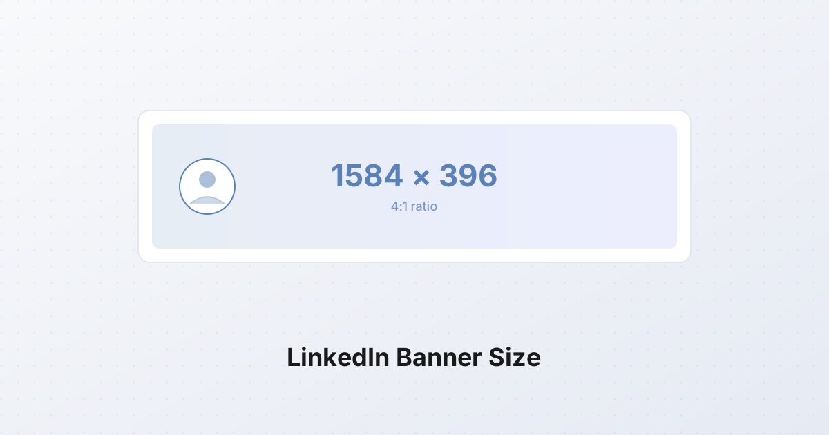
LinkedIn's official documentation says your cover photo should be 1584 x 396 pixels, in JPG or PNG format, with a maximum file size of 8 MB. That is the entire spec they publish.
The number that matters more than any of those, however, is the aspect ratio: 4:1. LinkedIn will accept larger files (many designers upload 1920x480 or 2000x500 for extra crispness) but the platform downscales everything to 1584x396 on the display side. Anything that is not in a 4:1 ratio gets cropped, and you do not get to choose where.
A few practical notes about the spec:
- 1584x396 is a non-negotiable display size. Upload a 1600x400 image and LinkedIn will crop or letterbox it. Upload a clean 4:1 image and it will fit without surprises.
- JPG is safer than PNG for photographic content. LinkedIn recompresses every upload, and PNGs of photographs get hammered harder than JPGs of the same scene. PNG is still the right call for flat graphics, gradients, and text-heavy banners.
- 8 MB is generous; aim for under 1 MB. LinkedIn's CDN will recompress anything you upload. A 6 MB banner comes out looking worse than a 600 KB banner you compressed yourself, because you cannot control the second compression pass.
- Upload at 2x if you want retina sharpness. Some designers push to 3168x792 (exactly 2x the official size). The visual gain is small but measurable on high-DPI laptops and phones.
The profile picture overlap problem
The single most important thing to understand about LinkedIn banners is also the one the official spec does not mention: your profile picture sits on top of your banner, covering its bottom-left corner.
On desktop, your profile photo is rendered as a 400x400 circle (downsized from whatever you uploaded, but always displayed as a circle) positioned so that its top half overlaps the banner and its bottom half hangs below it into the profile body area. The center of the circle sits roughly 200 pixels in from the left edge and 100 pixels down from the top of the banner. Which means a circular zone approximately 400x400 pixels in the bottom-left is permanently obscured by your own face (or your company logo).
The practical implication: any text, logo, or important graphic in the bottom-left 400 pixels of your banner is invisible. This is the number-one mistake on LinkedIn banners, and it is entirely avoidable.
The safe zone, mapped
Combining the profile picture overlap with mobile cropping (covered next), the area guaranteed to be visible on every device and at every breakpoint is roughly the middle 1000 pixels horizontally, centered vertically. Here is the map, drawn at one-quarter scale:
1584 x 396  (displayed at 4:1)

   0                                              1584
0  +--------------------------------------------------+
   |  TOP MARGIN: ~60 px cropped on mobile            |
   |  Avoid critical content in the top 60 px         |
60 +--------------------------------------------------+
   |                                                  |
   |  +---------+    SAFE ZONE    +---------+         |
   |  | PROFILE |  ~1000 px wide  |  RIGHT  |         |
   |  |  PIC    |  centered, ~276 |  MARGIN |         |
   |  | COVERS  |  px tall        |  ~250px |         |
   |  | ~400px  |                 |         |         |
   |  +---------+                 +---------+         |
   |                                                  |
336+--------------------------------------------------+
   |  BOTTOM MARGIN: ~60 px cropped on mobile         |
   |  Avoid critical content in the bottom 60 px      |
396+--------------------------------------------------+
   ^                                                  ^
   0                                                 1584
Translating the diagram into numbers:
| Zone | Pixels (x, y from top-left) | Status | |---|---|---| | Top margin | full width, y = 0-60 | Cropped on mobile | | Bottom margin | full width, y = 336-396 | Cropped on mobile | | Left margin (profile pic overlap) | x = 0-400, y = 80-396 | Obscured by profile photo | | Right margin | x = 1334-1584, y = 0-396 | Risky, sometimes clipped | | Safe zone | x = 400-1334, y = 60-336 | Visible on every device |
That safe zone is 934 x 276 pixels. Put your tagline, your name, your credentials, your brand mark, and any imagery that absolutely must be visible inside that box. Everything outside it is decoration that may or may not survive.
Mobile vs desktop: where the crop falls
LinkedIn's mobile app renders banners very differently from the desktop web. The mobile banner is displayed at roughly 1128 x 209 pixels on a typical phone (still 4:1, but the visible window is narrower), and LinkedIn crops the top ~60 pixels and bottom ~60 pixels of your 1584x396 source to fit the mobile frame.
In practice, this means:
- Desktop viewers see almost the full 1584x396, minus the profile picture overlap in the bottom-left.
- Mobile viewers see the horizontal center of your banner, with the top 15% and bottom 15% cropped away. The profile picture still overlaps the bottom-left, but it is smaller relative to the visible area.
The result is that the vertical center of your banner matters most. If you have a horizontal band of text running across the exact middle of the 396-pixel height (between y = 130 and y = 265), it will be visible on every device. Text that sits at y = 20 (top) or y = 380 (bottom) will be eaten by mobile cropping.
A useful rule of thumb: design as if only the middle 1584 x 276 horizontal band will survive, and treat the top and bottom 60 pixels as bleed area. Fill them with color or gradient, but do not put anything important there.
Design principles for a banner that survives LinkedIn's compression
LinkedIn applies aggressive JPEG-style compression to banner uploads. A 1 MB PNG can come out as a 90 KB recompressed artifact-ridden mess if you let the platform do all the work. Banners that survive the compression pipeline share a few traits:
Minimal text. Small text (under ~24 pixels at the source resolution) becomes a smear after recompression. The platform's CDN is tuned for photographs, not typography. If you must include text, keep it to one short line, 40 pixels or taller, set in a clean sans-serif at high contrast against its background.
Brand color or gradient background. Solid colors and smooth gradients compress cleanly. Detailed photographs of busy scenes (a city skyline, a forest, an office) turn into blocky mush after LinkedIn's recompression. A single brand color, or a two-stop linear gradient, will look as crisp at 90 KB as it did at 1 MB.
One key message. A tagline ("I help SaaS founders ship faster"), a value proposition ("B2B content for technical buyers"), or three credentials ("Ex-Google. Ex-Stripe. Now advising."). Not all three. The banner is a billboard, not a resume. People see it for a fraction of a second when they scroll past your name; you get one idea, maybe two.
Avoid stock photos of handshakes. And boardrooms. And people pointing at laptops. And the "two professionals collaborating" shot. Everyone has seen these a thousand times. They signal nothing except that you searched a stock library. If you want imagery, use something specific to you: your actual workspace, a product screenshot, a real photograph you took. Specificity beats polish.
Contrast over cleverness. A dark gray tagline on a slightly less dark gray gradient looks elegant in Figma and is invisible on a phone in direct sunlight. Pick a background and a foreground that are at least 4:1 in contrast ratio, the same standard as accessible body text.
Personal profile vs Company page: same size, different conventions
The technical spec is identical: 1584x396, 4:1, 8 MB max, JPG or PNG. The profile picture on a Company page is the same shape (a square rendered as a rounded square or circle depending on context) and sits in the same bottom-left position.
The conventions, however, differ:
Personal profile banners tend to work best when they communicate one of three things:
- A one-line value proposition (what you do, for whom)
- A visual cue that anchors your expertise (a code editor for an engineer, a camera for a photographer)
- A neutral brand color with your name rendered in a custom typeface
Company page banners have a different job: they reinforce the brand, not the individual. Common patterns that work:
- The product interface, cropped to 4:1, with the most recognizable UI element in the safe zone
- A brand-color gradient with the company logo positioned in the right third of the safe zone (avoiding the profile pic on the left)
- An abstract pattern derived from the brand's visual language
Company pages also benefit from being updated quarterly. A fresh banner signals an active presence, and LinkedIn's algorithm gives a small visibility bump to pages that refresh their cover photo.
Common mistakes (and how to fix them)
Text in the bottom-left. Anything you put in the bottom-left 400 pixels of the banner gets covered by your profile picture. Move text to the center or right third of the safe zone.
Text in the top or bottom 60 pixels. Mobile crops these out. Constrain critical content to y = 60 through y = 336.
Too much detail. A banner that looks great at 100% in Photoshop becomes visual noise at 200 pixels tall in a feed preview. Step back from your screen and squint. If you cannot read the text and identify the main graphic from across the room, it has too much detail.
Using a 16:9 image. A 1920x1080 photo is a common starting point, it is what phones and cameras produce by default. Forced into a 4:1 banner, it either gets squashed (everything looks short and wide) or letterboxed (black bars top and bottom, with the banner occupying a thin horizontal strip in the middle). Crop, do not stretch.
Forgetting the right margin. The right ~250 pixels of the banner are sometimes clipped on narrow desktop windows. Keep your logo or key text at least 250 pixels in from the right edge.
Saving as PNG with a photographic background. PNG is lossless, which sounds good, until LinkedIn recompresses it as a low-quality JPG and your photographic background picks up banding and artifacts. For photographic banners, save as JPG at quality 85 from the start. For flat graphics and gradients, PNG is fine.
Resizing an existing image to 1584x396
Most people do not have a 4:1 source image lying around. You will usually start with a photograph or screenshot in a different aspect ratio (3:2, 4:3, or 16:9) and need to fit it into 4:1. Two operations get you there:
- Resize the longest edge to 1584 pixels (if the source is wider than 4:1) or resize to a height that gives you at least 396 pixels (if the source is narrower than 4:1).
- Crop to exactly 1584x396, positioning the crop window over the most important part of the image.
The SynoxTools resizer handles the first step: set the target to 1584x396 with fit mode, and the tool scales the image so the longest matching dimension hits the target. The cropper handles the second step: drag the crop window to the part of the image you want to keep, lock the aspect ratio to 4:1, and export at exactly 1584x396.
A third option for images that are already wider than 4:1: crop first, then resize. This avoids scaling artifacts and gives you the most control over composition.
For images that are narrower than 4:1 (a portrait photo, for instance), you cannot crop without losing the subject. In that case the move is to composite: place the portrait on the right side of a 1584x396 canvas with a solid or gradient background filling the rest. This is the standard pattern for speaker bios and consultant banners.
A separate spec: cover photos for LinkedIn articles
LinkedIn has a second cover image spec that gets confused with the profile banner: the article cover photo, which is 1280x720 pixels (16:9), JPG or PNG, max 5 MB. This is the image that appears at the top of a long-form LinkedIn article published via the publishing tool, and in the article preview card when the article is shared in the feed.
The two specs are completely independent. Your profile banner stays at 1584x396 (4:1). Your article covers are each 1280x720 (16:9). A 4:1 banner uploaded as an article cover will be letterboxed or cropped to 16:9; a 16:9 image uploaded as a profile banner will be squashed or cropped to 4:1. Keep them separate.
Article covers benefit from a different design philosophy than banners: they can carry more detail, more text, and more composition, because they are viewed at a larger size and in a context where the viewer has chosen to read. Treat article covers like blog post hero images, not billboards.
Step-by-step: making a LinkedIn banner from scratch
Here is the full workflow, start to finish, for a banner that hits the spec and survives compression.
1. Define the one message. Before opening any tool, write down the single thing the banner should communicate. Examples: "I write B2B SaaS content." "Founder of [Company]." "Ex-[BigTech], now building [Thing]." One sentence. If you cannot fit it on a sticky note, it is too long for a banner.
2. Pick a background. Brand color, two-stop gradient, or a single high-contrast photograph (in which case, see step 4). Avoid anything busier than that. The background fills the entire 1584x396 canvas, including the top and bottom 60 pixels that mobile will crop.
3. Build at 1584x396 in your editor. Figma, Canva, Photoshop, Affinity, any of them work. Set the canvas to exactly 1584x396 pixels. If you want retina sharpness, work at 2x (3168x792) and downscale at export.
4. Place your content inside the safe zone. The safe zone is x = 400 to 1334 and y = 60 to 336, a 934x276 box in the center. Put your text, your logo, and any critical graphic inside this box. The left 400 pixels are covered by the profile picture; the top and bottom 60 pixels are cropped on mobile.
5. Check contrast. Your foreground (text, logo) needs a contrast ratio of at least 4:1 against the background. If you are not sure, run the colors through any contrast checker, there are dozens free online.
6. Export as PNG (for flat graphics) or JPG at quality 85 (for photographic backgrounds). Aim for a file size under 1 MB. If your export is bigger, your background is probably too detailed, simplify it.
7. Preview at mobile size. Scale the banner down to 1128x209 in your editor (or just zoom out to 25%). This is approximately what mobile viewers will see. If the text is unreadable at this size, it is too small, increase the font size and remove words until it reads cleanly.
8. Upload to LinkedIn. Profile > Edit Profile > click the camera icon on the banner > Upload. LinkedIn will let you reposition the image slightly; use this to nudge the safe zone content into final position.
9. Verify on a phone. Open your profile in the LinkedIn mobile app. Confirm the text is visible, the profile picture is not covering anything important, and the top and bottom crops have not eaten critical content. Fix by repositioning in step 8, or by re-exporting with content moved further into the safe zone.
The whole process takes 20 minutes for a first banner, less once you have a template. The reward is a profile that looks intentional and professional on every device, in every context LinkedIn might display it: feed preview, profile page, mobile, desktop, search results. Most banners on LinkedIn fail one of those contexts. Yours does not have to.