The 2:3 rule
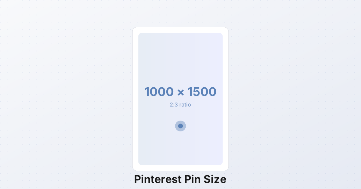
Every Pinterest pin starts with one decision: aspect ratio. The platform's feed is built around a 2:3 vertical frame, and the canonical pin size — the one Pinterest itself recommends, the one that performs in every credible repin study, the one that fits the feed without cropping or wasted space — is 1000×1500 pixels.
That is the spec. Memorize it. Everything else in this article is a refinement, but 1000×1500 is the floor.
Two variations exist and they matter:
- Square pins (1000×1000) render fine, but they take roughly 33% less vertical real estate in the feed than a 2:3 pin. Less space means less scroll-stopping power, which means fewer repins.
- Tall pins (1000×2000 or taller) grab even more feed space — sometimes the entire first viewport on a phone — but Pinterest truncates them with a "See more" gradient after roughly 1500 pixels in many feed contexts. Users have to tap to expand. Some do. Most scroll past.
The 2:3 ratio is the sweet spot: tall enough to dominate the feed, short enough to display fully without truncation. Pinterest has been consistent on this since 2018, when the platform moved from a 735×1102 standard to the current 1000×1500 to match the resolution of modern phone screens (which doubled from 750 wide to 1500+ between 2014 and 2018).
Why vertical wins on Pinterest
Pinterest is not a square-grid platform like Instagram. It is a masonry layout — pins of different heights are stacked into columns, like bricks of varying lengths. A taller pin pushes the next pin in its column further down, which means it occupies more vertical pixels per scroll position. On a phone, where roughly 80% of Pinterest sessions happen, a 2:3 pin takes up about two-thirds of the vertical viewport. A square pin takes half. That 17% difference is the gap between a pin that stops the thumb and a pin the thumb flies past.
The math is straightforward. The standard Pinterest feed card renders pins at 236 pixels wide on desktop and roughly 300–400 pixels wide on mobile, scaled to the screen. At 236 pixels wide:
- A 2:3 pin is 236 × 354 pixels in the feed — about 60% of a phone screen height.
- A 1:1 pin is 236 × 236 pixels — about 40% of a phone screen height.
- A 1:2 pin (1000×2000) is 236 × 472 pixels — about 80% of a phone screen height.
Taller pins get more attention per impression. Internal Pinterest data — shared at the 2022 Creator Festival and consistent across third-party studies — suggests 2:3 pins get roughly 30–40% higher clickthrough than square pins, and tall pins (1:2 or taller) see another 10–15% lift on top of that, but only when they aren't truncated. The truncation penalty erases most of the gain.
The takeaway: design for 2:3 first. Use taller formats only when you can guarantee the content earns the tap to expand.
The full pin spec
| Property | Value | |---|---| | Aspect ratio | 2:3 (vertical) | | Recommended dimensions | 1000×1500 px | | Minimum dimensions | 600×900 px (Pinterest will accept it, but the feed will look soft) | | Maximum dimensions | 1000×1500 px is recommended; taller pins up to 1000×3000 px are accepted | | Square alternative | 1000×1000 px | | File formats | JPG, PNG, WebP | | Max file size | 32 MB | | Recommended file size | Under 300 KB for fast load | | Color profile | sRGB (avoids color shift in Pinterest's CDN) |
The 32 MB ceiling is generous to the point of being a trap. A 32 MB pin takes seconds to load on mobile data, and Pinterest's CDN will recompress it aggressively — often with visible artifacts — before it reaches the feed. Aim for 150–300 KB. That means JPG at quality 85–90 for photographs, PNG for graphics with text, or WebP at quality 85 for either. A 1000×1500 JPG at quality 85 typically lands at 180–260 KB.
Pin types and their dimensions
Pinterest supports several pin formats, each with its own dimensions and use case. Here is the comparison:
| Pin type | Dimensions | Aspect ratio | Format | Length | Best for | |---|---|---|---|---|---| | Standard pin | 1000×1500 px | 2:3 | JPG/PNG/WebP | Static | Blog posts, products, recipes | | Video pin | 1000×1500 px | 2:3 | MP4 | 5–60 sec | Tutorials, demos, before/after | | Story pin (now Idea pin) | 1080×1350 px per frame | 4:5 | Multiple frames | Up to 20 pages | Multi-step guides, listicles | | Idea pin | 1080×1350 px per frame | 4:5 | Multiple frames, video, audio | Up to 20 pages | Tutorials, collections, narratives | | Carousel pin | 1000×1000 or 1000×1500 px | 1:1 or 2:3 | 2–5 images, swipeable | Static | Product galleries, multi-angle | | Square pin | 1000×1000 px | 1:1 | JPG/PNG | Static | Cross-posting from Instagram |
A note on naming: Pinterest has renamed Story pins to Idea pins (and at various points called them both). The format is the same — multiple frames in a single pin, often with text and music overlays. If you see "Story pin" in older tutorials, that is an Idea pin now.
The standard pin (1000×1500) is what you will create 80% of the time. The other formats serve specific use cases — video for demos, Idea pins for multi-step tutorials, carousels for product galleries. Don't try to use every format. Pick one or two that match your content type and master them.
Design principles for high-repin pins
Pinterest is a visual search engine, not a social network. People don't follow you the way they follow on Instagram — they search, they save, they leave. That changes the design priorities. A pin that gets repinned is a pin that:
- Stops the scroll in a feed at 236 pixels wide. That means bold color, a single clear subject, and text overlay readable at thumbnail size.
- Communicates the promise in under 2 seconds. Pinterest users scan quickly. If they have to read three lines of text to understand what the pin is about, they are gone.
- Matches what they searched for. Pinterest SEO is keyword-driven; the visible text on the pin should mirror the words a user would type.
Bold, readable text overlay
The single highest-leverage design decision on a Pinterest pin is text overlay. Pinterest's own analytics show pins with text overlay get 2–3x more repins than the same image without text. The reason is mechanical: Pinterest is visual search, and the algorithm indexes the text rendered on the image (via OCR) alongside the pin title and description. Text on the pin is text the algorithm can match to a query.
Rules for text overlay:
- Headline at 60–90 pt equivalent. At 1000×1500 px, that is a font size of roughly 80–120 pixels. Test by shrinking your pin to 236 px wide — if the headline is still legible, it is big enough.
- Sans-serif fonts (Inter, Poppins, Montserrat) outperform decorative scripts in clickthrough tests. Decorative fonts work for branding elements (a logo, a signature) but fail for headlines.
- High contrast against the background. White text on a dark photo, dark text on a light photo. If the background is busy, add a translucent panel behind the text.
- Maximum 8 words. Anything longer becomes a paragraph, and paragraphs don't get repinned.
One clear subject or promise
The best pins answer a single question. "5 Easy Dinner Recipes Under 30 Minutes." "How to Grow Tomatoes in Containers." "10 Packing Cubes That Actually Fit." The promise is on the pin, the user knows what they are saving, and the destination delivers on the promise.
Multi-subject pins — "Healthy Recipes, Workout Tips, and Travel Hacks" — confuse both the user and the algorithm. Pinterest's recommendation engine categorizes pins by topic. A pin that signals three topics gets categorized as none of them, and its distribution collapses.
Brand colors and consistent aesthetic
Pinterest users build mental models of accounts they trust. If your pins use the same 2–3 colors, the same font, and the same photo treatment every time, users start recognizing your pins in the feed before they read the text. Recognition drives repins — a familiar pin gets saved at roughly 2x the rate of a stylistically random one, even when the content quality is identical.
Pick a palette of 3 colors and a single headline font. Use them on every pin for at least 6 months before you consider changing.
Logo or URL in a corner
A small logo or URL in the bottom-right corner — maybe 80×80 px — establishes ownership without distracting from the headline. Pinterest pins get screenshotted, cropped, reuploaded, and repinned across years. A logo on every pin means attribution survives the journey.
Do not make the logo prominent. A pin that is 30% logo reads as an ad, and Pinterest users don't repin ads.
Multi-image collages for listicles
If your pin promises "10 Tips" or "7 Tools" or "5 Mistakes," a multi-image collage that shows 3–4 of those items visually outperforms a single image. The collage communicates "this is a list with multiple things inside" in a way a single photo cannot.
The SynoxTools collage tool handles this in your browser — drop in 3–4 product shots or step photos, choose a Pinterest template, and the tool composites them into a 1000×1500 frame with consistent spacing. Add your headline text overlay on top and you are done.
Pinterest SEO: how pins actually get found
Pinterest is a search engine. The discovery mechanism is text matching — not graph-based "people you follow" the way Instagram works. Four text fields determine whether your pin shows up in search results:
- The visible text on the pin image (OCR'd by Pinterest's algorithm). This is the most important field — it is the only one the user sees before they click.
- The pin title (the text field you fill in when uploading). Limited to 100 characters. Treat it like a search query: "5 Easy Dinner Recipes Under 30 Minutes" beats "My Favorite Weeknight Meals."
- The pin description (the longer text field, up to 500 characters). Include related keywords naturally. Don't keyword-stuff — Pinterest's algorithm penalizes repetitive keyword lists.
- The board name where the pin is saved. Pins on boards named "Healthy Dinner Recipes" get indexed for recipe searches; pins on boards named "Yum!" don't get indexed for anything.
Write descriptive, keyword-rich titles. "How to Grow Tomatoes in Containers — Full Guide" is better than "Tomato Post." "10 Best Packing Cubes for Travel (Tested)" is better than "Packing Cubes." The title is doing two jobs: telling the user what the pin is, and telling the algorithm what queries to serve it for.
Common mistakes that kill repins
Horizontal images. A 1500×1000 landscape pin renders at 236×157 pixels in the feed — barely visible. The user scrolls past without ever registering what the image is. Horizontal pins perform roughly 70% worse than vertical pins of equivalent content quality. There is no good reason to post a horizontal pin on Pinterest. Crop it.
Text too small. A pin designed at 1000×1500 with a 30 pt headline looks fine at full size. In the feed at 236 px wide, that headline becomes 7 px tall — illegible. Always preview your pin at thumbnail size before publishing. If you can't read the headline at 236 px wide, neither can your audience.
Too much text. Pinterest demotes pins that are more than ~20% text by area. The platform's content guidelines explicitly discourage text-heavy pins, and the algorithm enforces it. A pin that's a paragraph of text with a small image performs like a bad meme — it doesn't get repinned and it doesn't get served. Keep text to a headline (8 words max) and maybe a small subheadline.
No text overlay at all. A photo with no text overlay is a pin that depends entirely on the pin title and description for SEO. That is giving up the highest-leverage discovery channel. Even a minimal "5 Tips" overlay turns a generic photo into a clickable promise.
Inconsistent dimensions within a campaign. If you are posting 10 pins for one campaign, make them all 1000×1500. Mixing in a square and a tall pin breaks the visual rhythm of your account and dilutes the brand recognition effect.
How to make a Pinterest pin (step by step)
Here is the full workflow for a single standard pin, from raw image to published.
1. Pick your source image. A vertical photo (or a photo you can crop vertically) works best. If your source is horizontal, you will either crop it to 2:3 (losing content on the sides) or composite it onto a vertical canvas with a colored background.
2. Resize or crop to 1000×1500. Use the SynoxTools resizer to set exact dimensions, or the cropper if you need to recompose the image at the 2:3 ratio. The cropper shows you the 2:3 grid overlay so you can position the subject correctly before committing.
3. Add text overlay. Drop your headline onto the image — white or dark text depending on the background, 80–120 pixels tall, sans-serif, max 8 words. Add a translucent panel behind the text if the photo is busy.
4. Add your logo. Bottom-right corner, 80×80 px, low opacity. Establishes attribution without distracting from the content.
5. Export as JPG at quality 85. A 1000×1500 JPG at q85 typically lands at 180–260 KB — well under the 300 KB target. Use PNG only if your pin is mostly graphics with sharp text edges; PNG files at this size run 500 KB–2 MB, which is heavier than necessary.
6. Write the pin title. 100 characters max. Front-load the keyword. "5 Easy Dinner Recipes Under 30 Minutes" beats "My 5 Favorite Quick Dinners."
7. Write the pin description. 200–500 characters. Include 3–5 related keywords naturally. Describe what the user will get when they click.
8. Save to a keyword-rich board. Board name should mirror the pin's topic. Save the pin to "Healthy Dinner Recipes" not "Food I Love."
9. Publish. Pin it. Pinterest's initial distribution happens within the first 24–48 hours; if the pin performs well in that window (saves, clicks), the algorithm extends its reach. If it underperforms, distribution drops off.
Batch: building a 20-pin campaign
Single pins don't move traffic. Pinning cadence does. A serious Pinterest strategy means publishing 5–20 pins per week, consistently, for months. That volume requires a batch workflow.
The pattern that works:
- Plan 20 pin concepts in a spreadsheet. One row per pin: headline, source image URL, target board, pin description. This is the editorial step — don't skip it.
- Source or shoot 20 images. All vertical, or shoot horizontal and plan to crop.
- Batch-crop to 2:3. Drop all 20 images into the batch converter, set output to 1000×1500 JPG at quality 85, and process them all at once. You get a ZIP of 20 cropped, resized images.
- Add text overlays individually. This is the step you can't batch — each pin needs its own headline. Use your design tool of choice. 20 pins takes 2–4 hours if you are efficient.
- Schedule with Pinterest's native scheduler (or a tool like Tailwind). Spread the 20 pins across 2–4 weeks, 3–5 per week. Pinterest's algorithm favors consistent cadence over bursts.
The batch step that matters most is the cropping and resizing. Doing 20 images one at a time is tedious; the batch path turns 2 hours of clicking into 5 minutes of waiting.
The discipline that compounds
One pin gets you nothing. Ten pins get you almost nothing. A hundred pins, published across six months, each one targeting a specific search query, each one with a clear text overlay and a keyword-rich title — that is when Pinterest starts sending real traffic. The platform rewards volume and consistency more than any individual pin's brilliance.
The mistake most people make is treating Pinterest like Instagram — posting a single pin, waiting for it to go viral, getting discouraged. Pinterest doesn't work that way. It is a search engine with a slow-rolling distribution curve. A pin published in March might peak in October, when seasonal search demand catches up to it. The accounts that win on Pinterest are the ones that publish consistently, target keywords methodically, and trust the long tail.
Set up the 1000×1500 template once. Use it for every pin. Build the batch workflow. Publish weekly. Six months from now, check your analytics — Pinterest will likely be your second or third biggest traffic source, behind Google and direct. That is the playbook, and the size spec is the foundation of it.