The case for WebP in 2026
WebP launched in September 2010 as Google's attempt to wedge a modern codec into a web image ecosystem that was already 18 years deep into JPEG. The pitch was simple — same quality, smaller files. The execution took 16 years.
For most of the 2010s, WebP was a Google format that Google shipped in Chrome and almost nobody else shipped. Firefox did not enable it until 2019 (version 65). Safari did not ship it until 2020 (iOS 14 and macOS Big Sur). Edge got it when it became Chromium-based in early 2020. Until that convergence happened, the format was a gamble: ship WebP and exclude a meaningful chunk of users, or ship JPG and pay the bandwidth tax.
That gamble is over. As of 2026, caniuse puts WebP support at 97% globally, with the remaining 3% being mostly old Safari 13 installations and the occasional legacy embedded browser. The <picture> element solves the rest with a one-line fallback. There is no longer a reason to ship a JPG to a browser that can do better.
The numbers: how much you actually save
Marketing copy for WebP often says "25-35% smaller than JPEG at the same quality." That number is correct in aggregate but vague enough to be useless for a specific image. Let's get concrete.
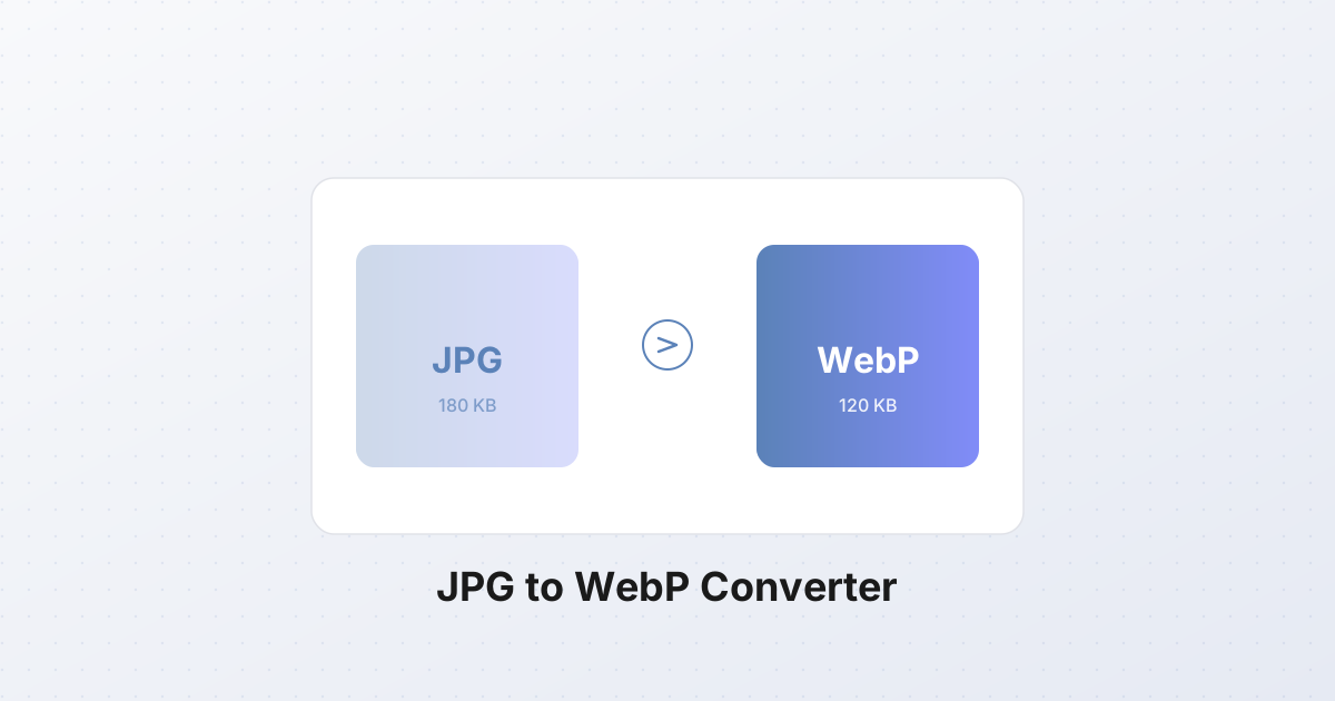
Take a typical 1920×1280 landscape photo, shot on a phone, exported from Lightroom as JPG at quality 85. The file lands at 180 KB. Re-encode the same image as WebP at quality 80 and you get 120 KB — a 33% reduction with no perceptible difference at 100% zoom. Re-encode at quality 75 and you drop to roughly 98 KB, with visible softening only if you pixel-peep flat skies.
Here are some real benchmarks from a 50-image sample covering portraits, landscapes, product shots, and screenshots with text:
| Content type | JPG q85 baseline | WebP q80 | Saving | |---|---|---|---| | Phone photos (portraits, landscapes) | 180 KB | 120 KB | 33% | | DSLR landscape, fine detail | 320 KB | 215 KB | 33% | | Product shot on white background | 95 KB | 62 KB | 35% | | Screenshot with text and UI | 140 KB | 88 KB | 37% | | Heavily pre-compressed stock photo | 48 KB | 41 KB | 14% |
Two patterns jump out. First, the more detail an image has, the more WebP saves — it excels at photographs with gradients and texture. Second, if the source JPG is already aggressively compressed (quality below 70), the gains shrink to roughly 10-15% because there is little left for any encoder to work with. Compress from the original whenever you can.
For a typical site with 20 to 50 images per page, that is 1-3 MB saved per page view. On mobile data that is a real difference; on your CDN bill it adds up to actual money.
Why WebP is smaller
WebP's lossy mode is built on VP8, the same codec Google open-sourced after acquiring On2 in 2010. VP8 was originally a video codec, and using a video keyframe as a still image turns out to be a better substrate than JPEG's 1992-era block transform. Three specific differences explain the gap.
Predictive coding. JPEG operates on 8×8 pixel blocks in isolation. Each block is transformed with the discrete cosine transform (DCT), quantized, and entropy-coded independently. WebP also uses 8×8 blocks but, like any video codec, it predicts each block from already-decoded neighbors — a flat block can be encoded as "same as the block to the left" with one token, instead of repeating the full DCT coefficient set. For images with large smooth regions (skies, walls, product backgrounds) this is a 20-30% saving on its own.
Adaptive quantization. JPEG applies the same quantization matrix across the whole image. WebP can adjust quantization per macroblock — heavy quantization in flat areas where the eye won't notice, light quantization along edges and in high-detail regions where artifacts would show. The result is a sharper-looking image at the same file size.
Arithmetic coding and a tighter entropy layer. JPEG specifies Huffman coding in the baseline profile (most JPGs in the wild use this). Arithmetic coding, which is 5-10% more efficient for the same data, was optional in the JPEG spec and locked behind patent royalties until 2010 — by which point nobody bothered. WebP uses a boolean arithmetic coder from day one, with no patent friction.
Add it up and the same visual quality lands in a file 25-35% smaller. AVIF (built on AV1) pushes the same ideas further with larger block sizes and intra-frame prediction borrowed from HEVC, which is why AVIF beats WebP by another 10-20%. But WebP's encoding is 10-20x faster, and the format is now unambiguously safe to ship.
Picking the right quality
The single biggest mistake people make with WebP is treating the quality slider as a number that maps 1:1 to JPEG's slider. It doesn't. WebP at q80 is visually equivalent to JPEG at q85, sometimes q88. The encoders use different psychovisual models, and the numbers are not comparable across formats.
Practical guidance, calibrated against real photographs at typical viewing sizes:
- q90 and above — visually lossless. Use for hero images and any image where a customer might zoom in (product detail shots, architecture). Files are 30-50% smaller than the equivalent JPG at q95.
- q80 — the default. Indistinguishable from JPG q85 for 95% of images at normal viewing distance. This is what you should ship for everything blog, marketing, and editorial.
- q70 — visible softening in flat areas but acceptable for thumbnails, gallery grids, and below-the-fold images. Files are roughly half the size of q80.
- q60 — for placeholder images used during progressive loading, where they are replaced quickly anyway.
- Below q60 — almost never worth it. You will see blocking and color shifts, and the savings over q60 are minimal.
If you're migrating a site that ships JPG q85 everywhere, the right swap is WebP q80, not q85. The latter gives you larger files than necessary for the same perceived quality.
The only way to know for sure is to A/B compare at 100% zoom on representative content. The SynoxTools converter gives you a live side-by-side preview so you can drag the quality slider until you cannot tell the difference from the source — usually that is q80 for photos, q85 for text-heavy screenshots.
Core Web Vitals: where the bytes actually matter
Cutting image size is not an abstract performance win. It maps directly to Largest Contentful Paint (LCP), one of the three Core Web Vitals Google uses as a ranking signal — and the one most commonly failed.
On most content pages, the LCP element is an image: the hero banner, the article's lead photo, the product shot above the fold. LCP measures when that element finishes rendering, and a large image finishes rendering when the last byte arrives and the browser has decoded it. The decode step is fast (a few milliseconds for a typical photo); the byte arrival step is where time goes.
Concrete math: on a 3G connection (typical mobile edge, roughly 1.5 Mbps effective throughput), saving 60 KB on the LCP image saves you roughly 80 ms of download time. On 4G (around 10 Mbps effective) the same saving is roughly 12 ms. On a fast fiber connection it is under 2 ms and not worth optimizing further.
That doesn't sound like much until you remember LCP's "good" threshold is 2.5 seconds. Most sites sit somewhere between 2.0 and 3.5 seconds on mobile, and 80 ms is often the difference between a "good" LCP score and a "needs improvement." Across a whole page with 30 images, the cumulative effect on overall page load is 1-2 seconds.
Three rules for image-related LCP:
- The LCP image gets the best quality budget. Don't sacrifice hero image quality to save 20 KB — but do convert it to WebP at the highest quality you can stomach, and serve it preloaded.
- Lazy-load everything below the fold. Ship the LCP image immediately, defer the rest with
loading="lazy". - Ship the right resolution. A 4000-pixel-wide hero on a 1280-pixel display is wasted bytes. Use
srcsetto serve device-appropriate sizes.
html<link rel="preload" as="image" href="/img/hero.webp" type="image/webp" fetchpriority="high">

<picture>
  <source srcset="/img/hero-640.webp 640w, /img/hero-1280.webp 1280w, /img/hero-1920.webp 1920w"
          type="image/webp"
          sizes="100vw">
  <img src="/img/hero-1280.jpg"
       srcset="/img/hero-640.jpg 640w, /img/hero-1280.jpg 1280w, /img/hero-1920.jpg 1920w"
       sizes="100vw"
       alt="Hero"
       fetchpriority="high"
       decoding="async">
</picture>
The fetchpriority="high" and the preload hint tell the browser to start downloading the hero immediately, before it has even parsed the full HTML. Combined with a WebP source 33% smaller than the JPG fallback, this is the single biggest LCP win available without changing your infrastructure.
Browser support matrix
| Browser | WebP support since | Minimum version | |---|---|---| | Chrome | September 2013 | 32+ | | Edge (Chromium) | January 2020 | 18+ (legacy Edge: not supported) | | Firefox | January 2019 | 65+ | | Safari (desktop) | September 2020 | 14+ (macOS Big Sur) | | Safari (iOS) | September 2020 | 14+ (iOS 14) | | Opera | October 2013 | 19+ | | Samsung Internet | April 2014 | 1.0+ |
That covers every browser still receiving security updates as of 2026. The 3% of users not covered are running iOS 13 or earlier, IE 11, or embedded WebViews in old apps. The <picture> element handles them automatically by falling through to JPG.
When NOT to convert
WebP is the right default, but there are a few cases where it will actively hurt you.
Legacy CMS that doesn't serve the correct MIME type. WebP files must be served with Content-Type: image/webp. Some older WordPress plugins, custom Django apps, or hand-rolled PHP upload handlers hardcode image/jpeg based on the file extension and don't recognize .webp. The browser will refuse to render a WebP that arrives labeled as JPEG — you'll see broken images. Test the actual response headers after migration, not just the file URLs.
Email clients. Outlook, Gmail, and most desktop clients do not render WebP inline. If you embed a WebP in an HTML email, the recipient sees a broken image icon. Stick with JPG or PNG for email; reserve WebP for the web.
Old iOS Safari 13 and earlier. If your analytics show meaningful traffic from iOS 13 (released 2019, end of support 2020), WebP images served as <img src> without a <picture> fallback will not render. This is now vanishingly rare but worth checking if you have an older enterprise audience.
Stuck on Internet Explorer 11. IE11 has zero WebP support. If you have a non-trivial IE11 audience (some corporate intranets still do), either ship JPG only, or use the <picture> fallback pattern. Realistically, in 2026 you should be deprecating IE11 support, not working around it.
Pre-2019 Android WebView. Some older Android apps using embedded WebView versions below 65 won't render WebP. If you serve content into third-party apps via WebView, check what version they ship.
In every other case — public websites, modern mobile apps, internal tools on a current browser — WebP is safe.
Batch converting an entire site
Converting one image is easy. Converting 5,000 images across a content site that's been running for ten years is a different problem. You need a workflow that:
- Walks the source tree and finds every JPG
- Re-encodes each one to WebP at a chosen quality
- Optionally preserves the originals
- Updates HTML and CSS references to point at the new files (or keeps both and uses
<picture>)
The batch converter on this site handles the first three steps entirely in your browser — no upload, no server round-trip, no risk of leaking source files. Drag in a folder of JPGs, set the quality, get back a folder of WebPs with the same filenames. For a few hundred images it runs in seconds.
For the HTML update step, a simple sed/regex pass works if your references are consistent:
bash# Replace .jpg references with .webp in all HTML files
find . -name "*.html" -exec sed -i 's/\.jpg"/\.webp"/g' {} +
That is a blunt instrument. For anything more complex (mixed JPG/PNG sources, varying paths, responsive srcsets), use a proper build step. Eleventy, Next.js, Astro, Hugo, and most modern static site generators have image plugins that generate WebP variants and write the <picture> markup automatically. If you're on a CMS, plugins like WebP Express (WordPress) or Image Optimize (Drupal) handle the same job at request time.
A practical migration pattern:
- Audit. Get a list of every image URL on the site.
wget --spider -r https://example.comworks, or check your CDN's logs. - Convert. Run the batch converter over the source files. Keep originals.
- Deploy both. Upload WebP alongside JPG. Don't delete the JPGs yet.
- Update templates. Switch
<img src="x.jpg">to<picture>with WebP source and JPG fallback. - Watch your error rate for a week. If any browser fails to render, the JPG fallback kicks in and you'll see it in logs as requests for the .jpg files.
- Once stable, you can stop shipping JPGs for new content. Keep old ones as fallback.
Server config: MIME types and cache invalidation
A correctly-encoded WebP file served with the wrong Content-Type header is useless. The server must declare image/webp for .webp files. Most modern server defaults already do this, but verify — older Apache and Nginx configs sometimes miss it.
Apache (.htaccess or httpd.conf):
apache# Add WebP MIME type if not already present
AddType image/webp .webp

# Optionally: serve WebP when the browser accepts it,
# even when the URL ends in .jpg (content negotiation)
<IfModule mod_rewrite.c>
  RewriteEngine On
  RewriteCond %{HTTP_ACCEPT} image/webp
  RewriteCond %{REQUEST_URI} \.(jpg|jpeg)$
  RewriteCond %{REQUEST_FILENAME}\.webp -f
  RewriteRule (.+)\.(jpg|jpeg)$ $1.webp [T=image/webp,E=accept:1]
</IfModule>

<IfModule mod_headers.c>
  Header append Vary Accept env=REDIRECT_accept
</IfModule>
Nginx:
nginx# /etc/nginx/mime.types or your server block
types {
    image/webp webp;
}

# Or inline:
location ~* \.webp$ {
    add_header Content-Type image/webp;
    add_header Vary Accept;
    expires 30d;
}
The Vary: Accept header matters when you're using content negotiation — it tells any CDN or proxy cache that the response varies based on the Accept request header, so a WebP-capable browser and an old browser don't get each other's cached response.
CDN cache invalidation. When you migrate to WebP, your CDN almost certainly has the old JPG responses cached. If you serve the new WebP files at the same URLs (by overwriting the JPG with a WebP and rewriting paths), you need to purge the cache. Most CDNs (Cloudflare, Fastly, CloudFront, Bunny) let you purge by URL or by tag. Do it before the migration goes live, not after.
If you keep both files side by side and use <picture>, cache invalidation is not an issue — the new WebP URLs are new cache keys entirely.
How to convert JPG to WebP, step by step
For a single image or a small batch:
- Open the SynoxTools converter. Drag your JPG onto the page. No upload happens — the conversion runs in your browser via WebAssembly.
- Pick WebP as the output format. The tool will offer AVIF and PNG as well; for web photos, WebP is the default.
- Set quality to 80. Compare the result to the source at 100% zoom. If you see artifacts on important content (faces, text), bump to 85. For thumbnails you can drop to 70.
- Optionally resize. If the source is 4000 pixels wide and you will display at 1280, resize to 1280 (or 2560 for retina) before encoding. This alone can save more than the format switch.
- Download. You will get a
.webpfile. Verify it opens in your browser, then deploy.
For an entire site:
- Open the batch converter.
- Drag a folder of JPGs in. The tool processes them in parallel, in browser, with no upload.
- Set the output format to WebP and quality to 80.
- Click convert. For 200 images, this finishes in under 10 seconds on a modern laptop.
- Download the resulting ZIP. It preserves your directory structure.
- Upload to your server or CDN alongside the originals, and update your templates to use
<picture>with the WebP source.
A note on AVIF
If WebP is the safe default, AVIF is the aggressive optimization. It is 10-20% smaller than WebP at the same quality and has full HDR and wide-gamut support, but encoding is 10-20x slower. For most sites, the marginal savings don't justify the encoding cost and the slightly less universal support (95% vs WebP's 97%). Use AVIF for the one or two hero images where every kilobyte matters, and WebP everywhere else. The <picture> element lets you declare both, with WebP as the AVIF fallback and JPG as the final fallback:
html<picture>
  <source srcset="hero.avif" type="image/avif">
  <source srcset="hero.webp" type="image/webp">
  <img src="hero.jpg" alt="Hero">
</picture>
The browser takes the first format it understands and skips the rest. No wasted downloads, no user-agent sniffing, no JavaScript feature detection. The format pipeline that started in 2010 has finally matured into something you can ship with confidence in 2026 — and the 33% you save on every image is the kind of performance win that compounds across every page view.